Outline

Introduction Gameplay & IntentionsMy Role

Art Director, Concept Artist, Game Designer

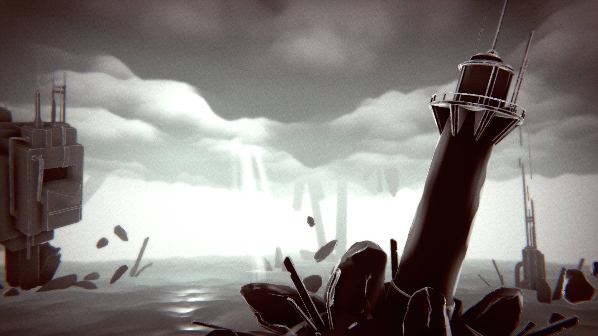
Unblighting is a 1st person arena shooter where the player must optimally exploit dual-purpose consumables obtained by killing enemies in specific ways to avoid getting overrun.

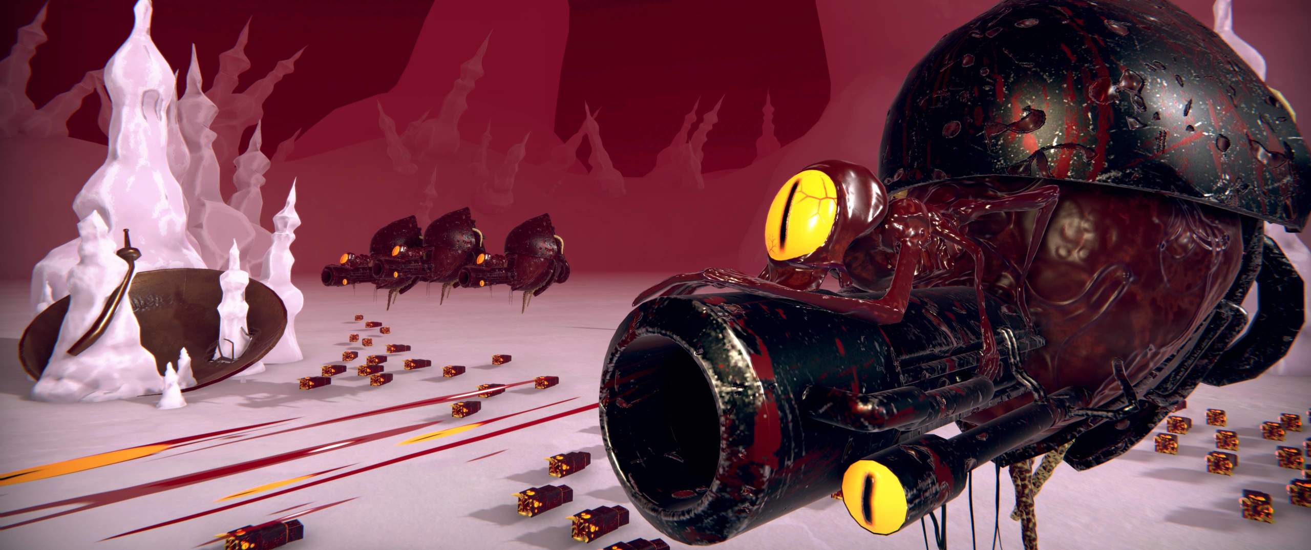
The game focuses on the feeling of piloting a heavy machine on an otherworldly battlefield.

Gameplay

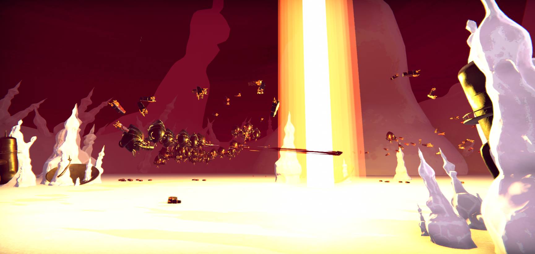
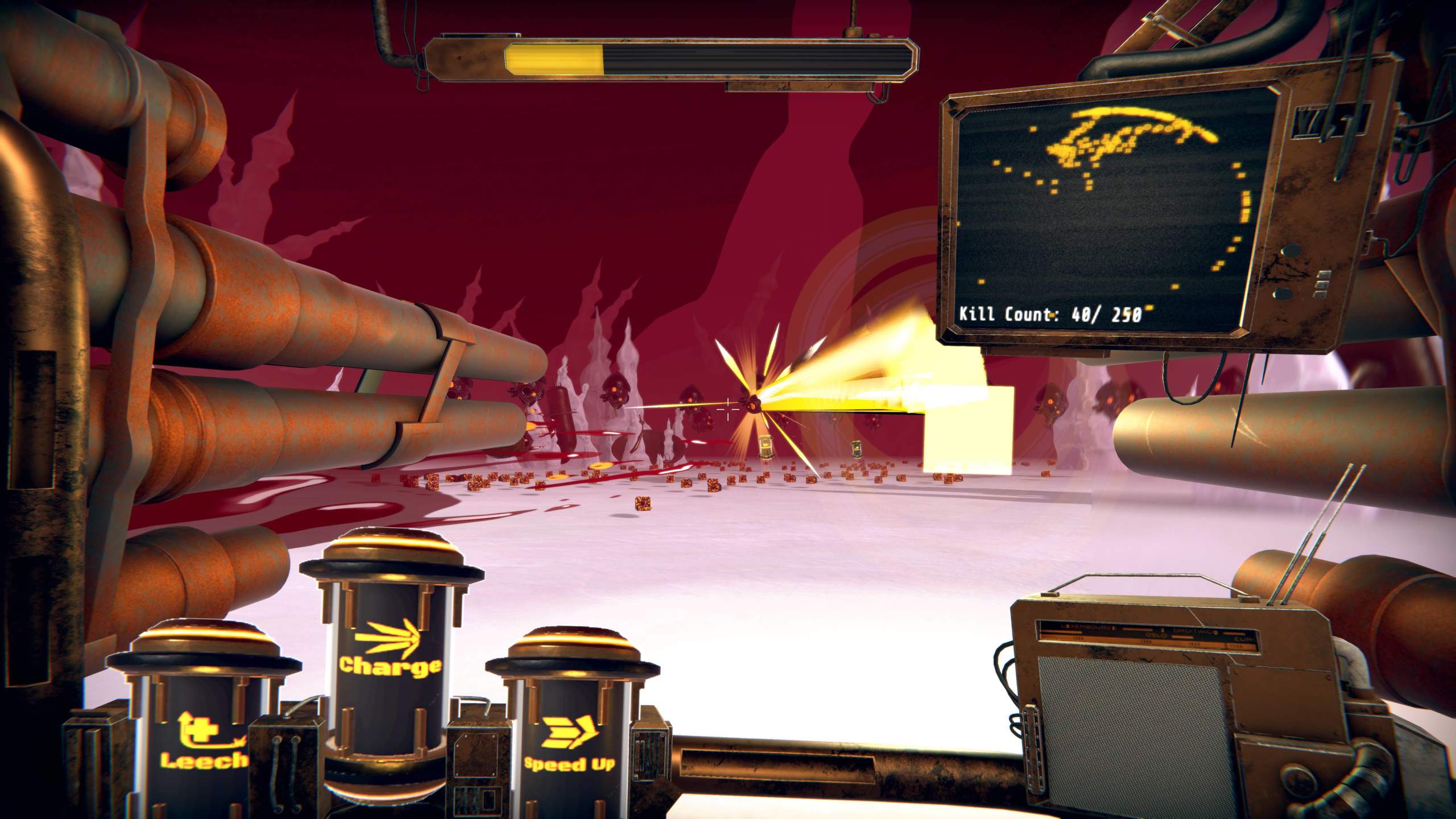
Unblighting is a 1st person arena shooter where the player must evaluate many combat options and pick the most valuable one in a given situation in order to eliminate hoards of enemies. The player can pick up Capsules, consumables that they may use in two different ways: it can be consumed to gain a temporary bonus dependant on its type, or be sacrificed and fired in front of the player. Shooting it as it travels will cause a massive explosion. Capsules are randomly dropped by enemies and the odds are fairly low. However, each enemy type can be eliminated in an 'ideal' way, requiring the player to perform a more challenging and spectacular action, and granting them a guaranteed Capsule.

Experience Intentions

A central part of this game's feel is conveying the weight and power of the mech piloted by the player, we really wanted to sell the impression of being in an imposing machine. Another core part of the experience is having to quickly process a lot of information at once (enemy positions and types, HP, tools available, etc), in order to pick the most optimal course of action. This also feeds into the idea that controlling mechs is very straining on the pilot's brain, reinforcing the first intention. Finally, the world is meant to feel strange and intriguing. We want the player to wonder where they are and what happened there.

My Role

Unblighting was developed by a team of 3 in 2 months as a student project.

I was in charge of:

Game Design

My role as a game game designer was first and foremost to convey that feeling of piloting a heavy machine. I also contributed to designing the Capsules and enemies, as well as some other player features. Read more

Visuals

I was responsible for designing all of the environment, player character and enemies, making concept art to explore ideas and communicate them to the 3D artist. I also made the VFX and player animations, and worked on the post processing. Read more

Game Design

I worked on transcribing the impression of piloting a heavy mech, creating the feeling of weight and power we were looking for.

Part of this came from making the player control something that has canons attached on each side rather than a regular handheld rifle, and having them view the world from the inside of a cockpit.

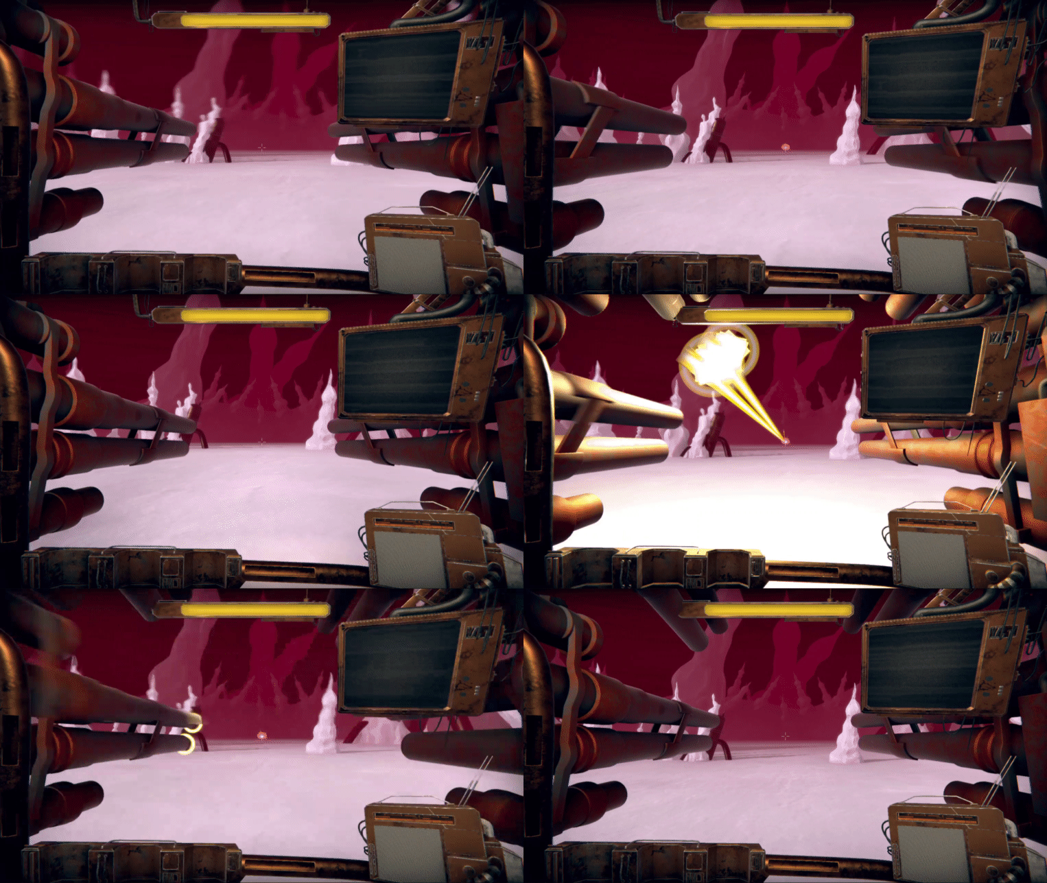
But a lot of the work went into adjusting the metrics of the character controller. It moves slowly, has inertia and a long acceleration time. However, during development I realised that we didn't go far enough in this direction, the gameplay at this stage revolved too much around moving and jumping, and didn't feel like we were controlling something heavy. So I removed the ability to jump, further reduced the speed and acceleration strength and increased inertia. We also added the turret mode (temporarily sacrificing the ability to move for double the canons) and increased fire rate to give the player something to do now that they couldn't jump everywhere while also creating this impression of being a slow but unstoppable force.

Finally, I further reinforced this through animations, so the character felt like something that walked heavily. Additionally, the cockpit tilts towards the direction the player is going, to make movement seem more natural and weighty. All of this to better sell the physicality of that machine.

Base movementNormal firing & turret mode

Visuals

Environment

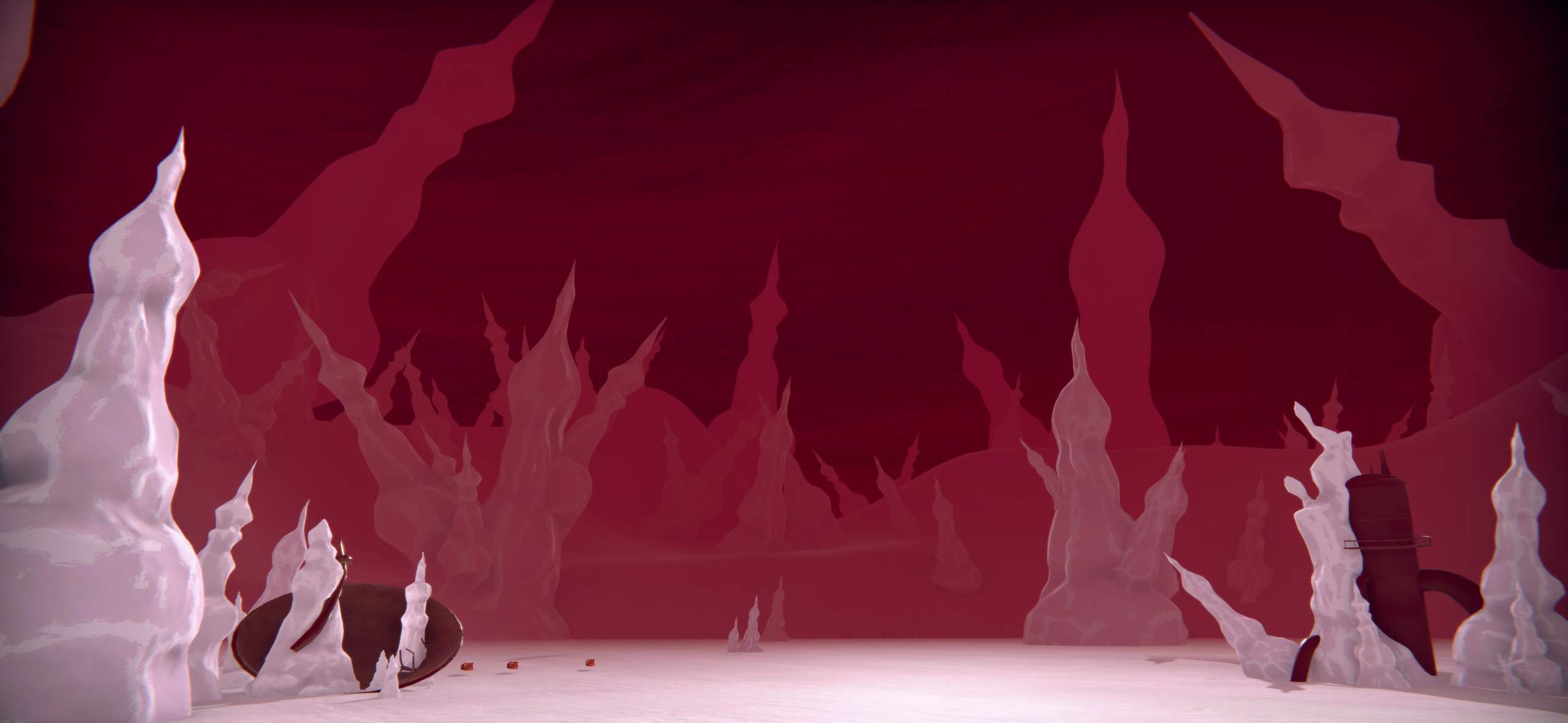
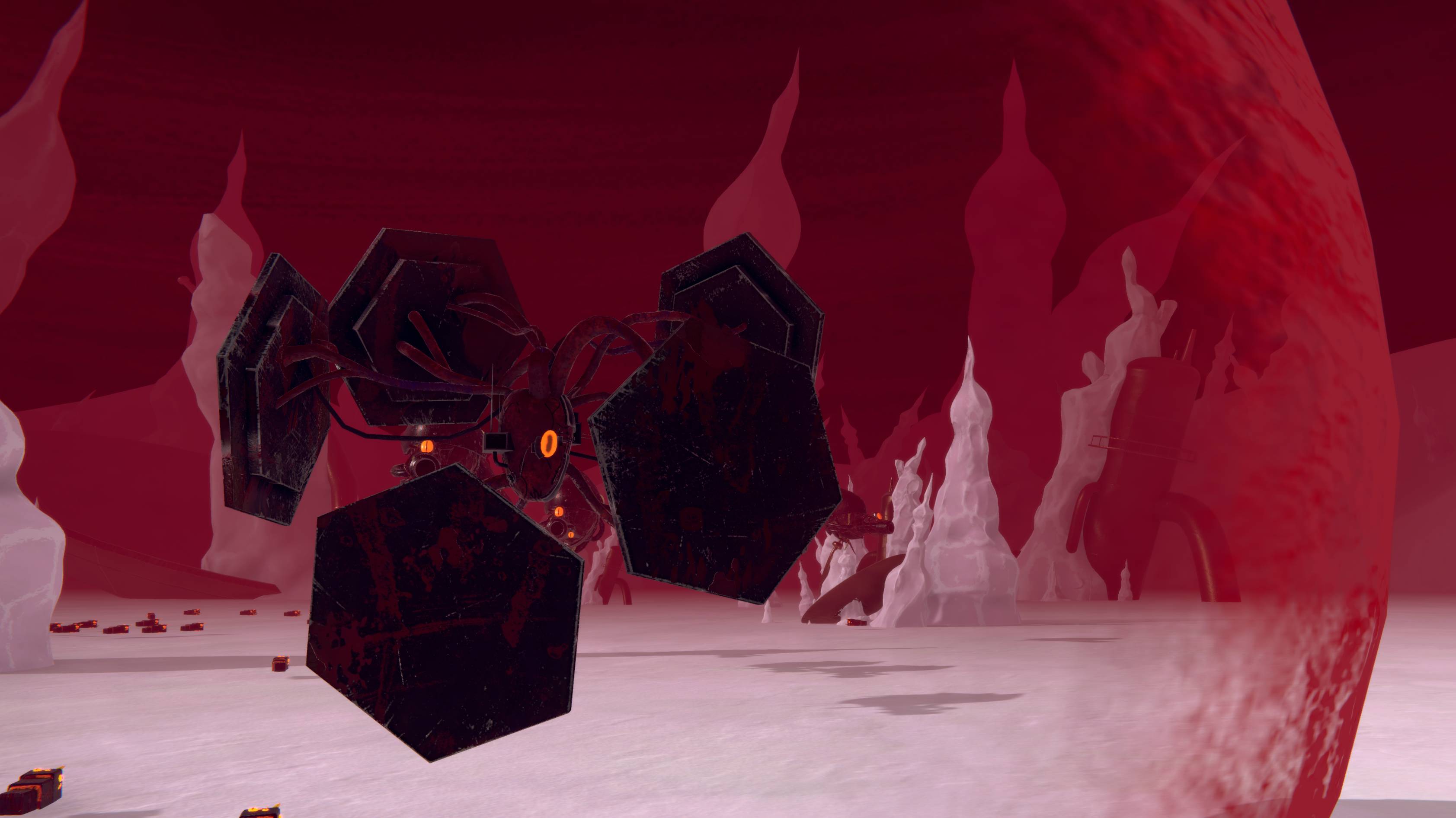
I designed the environment for the game. I wanted it to feel strange and otherworldly, to make the player wonder where they are and what happened here.

The first thing I established was the colour scheme, I knew very early the game needed this red sky and white ground of an unknown material. This immediately makes the landscape feel unnatural and unknown while also giving it a recogniseable identity.
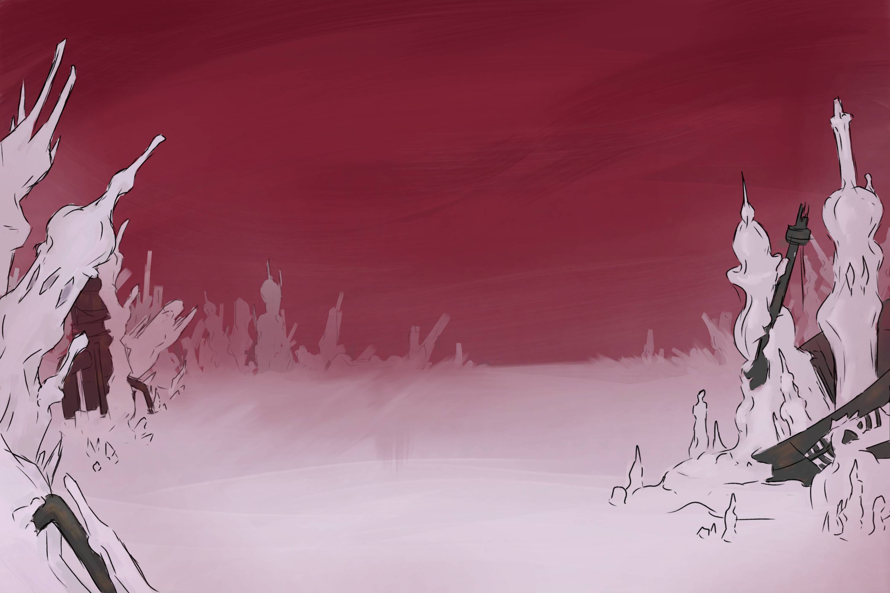
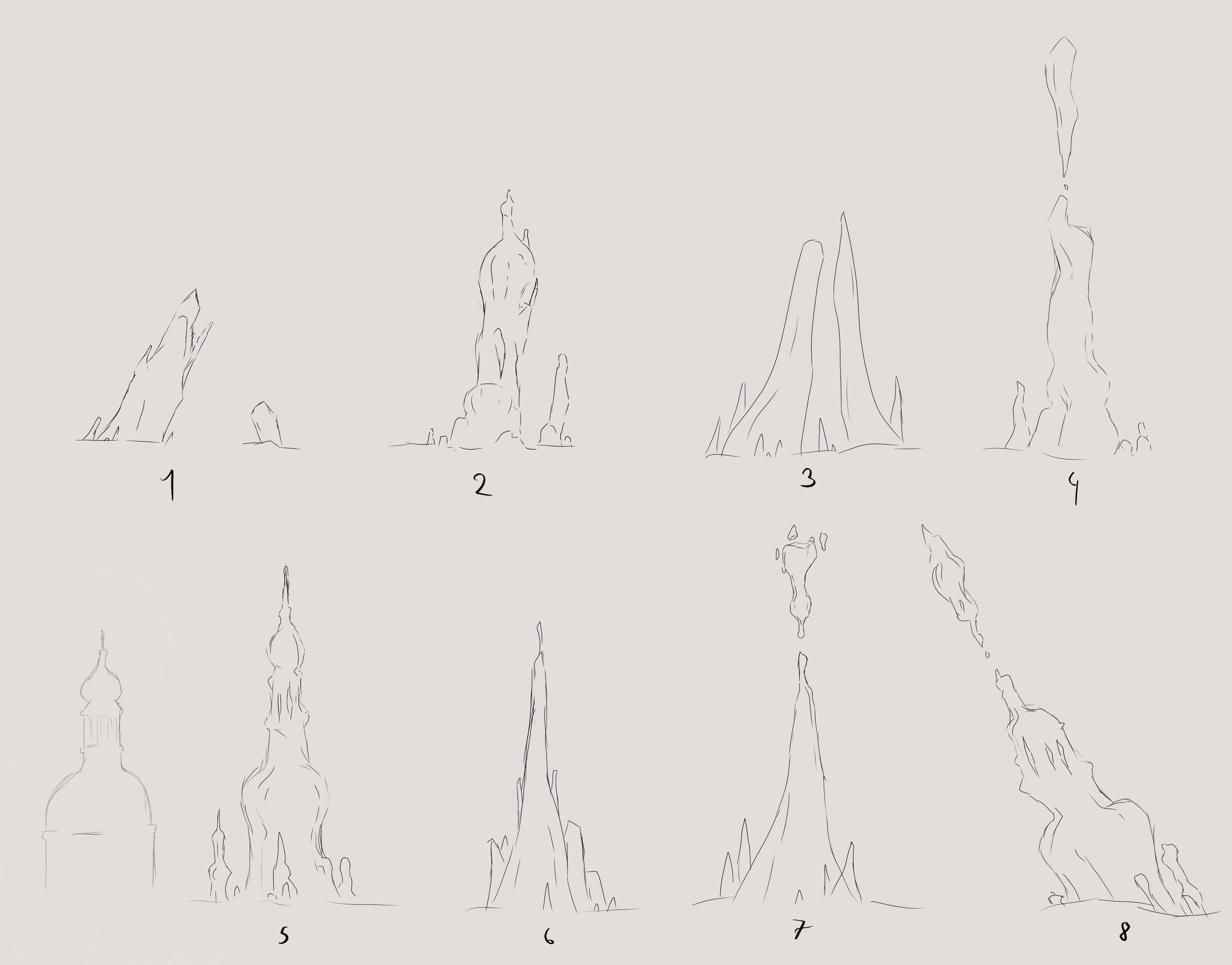
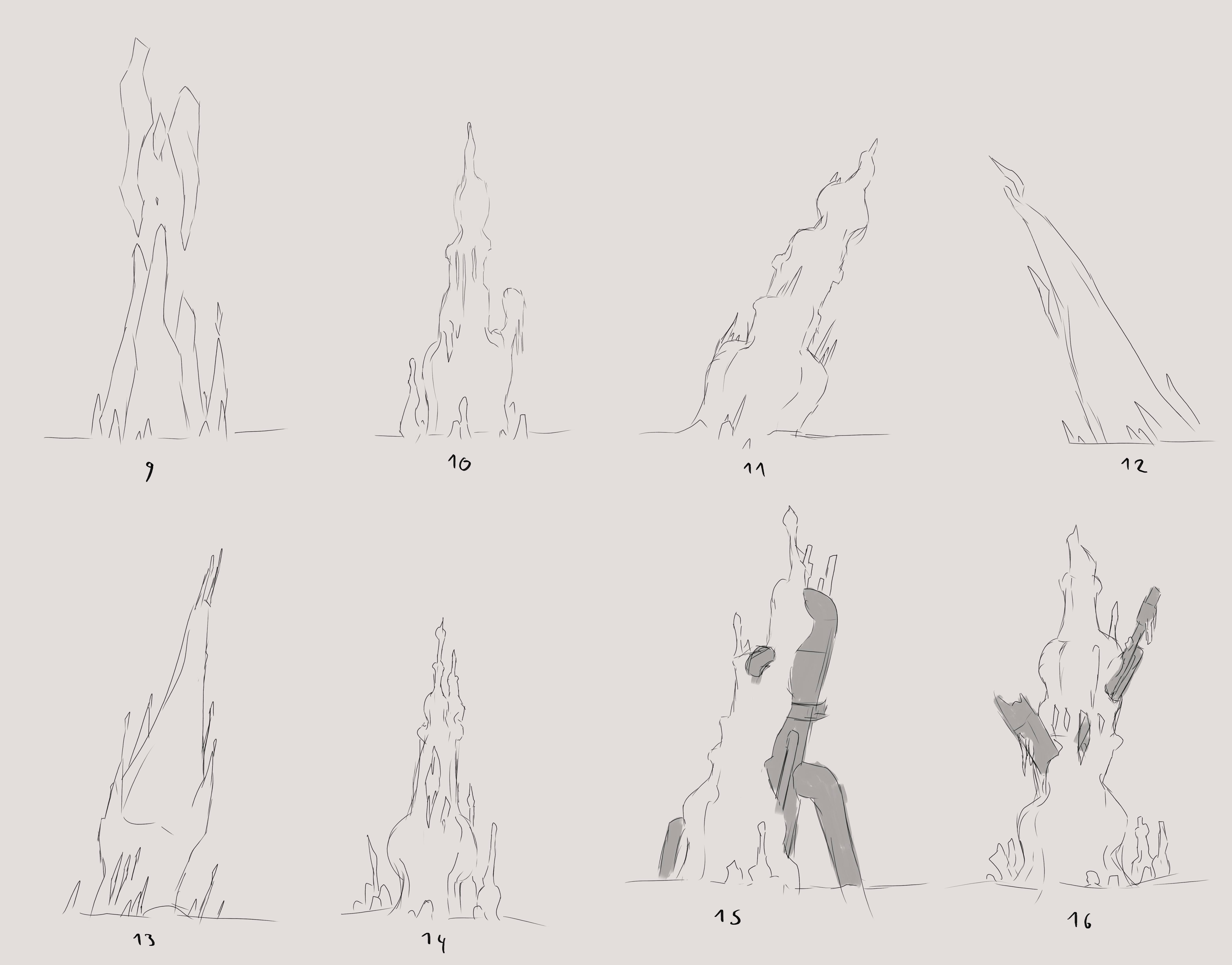
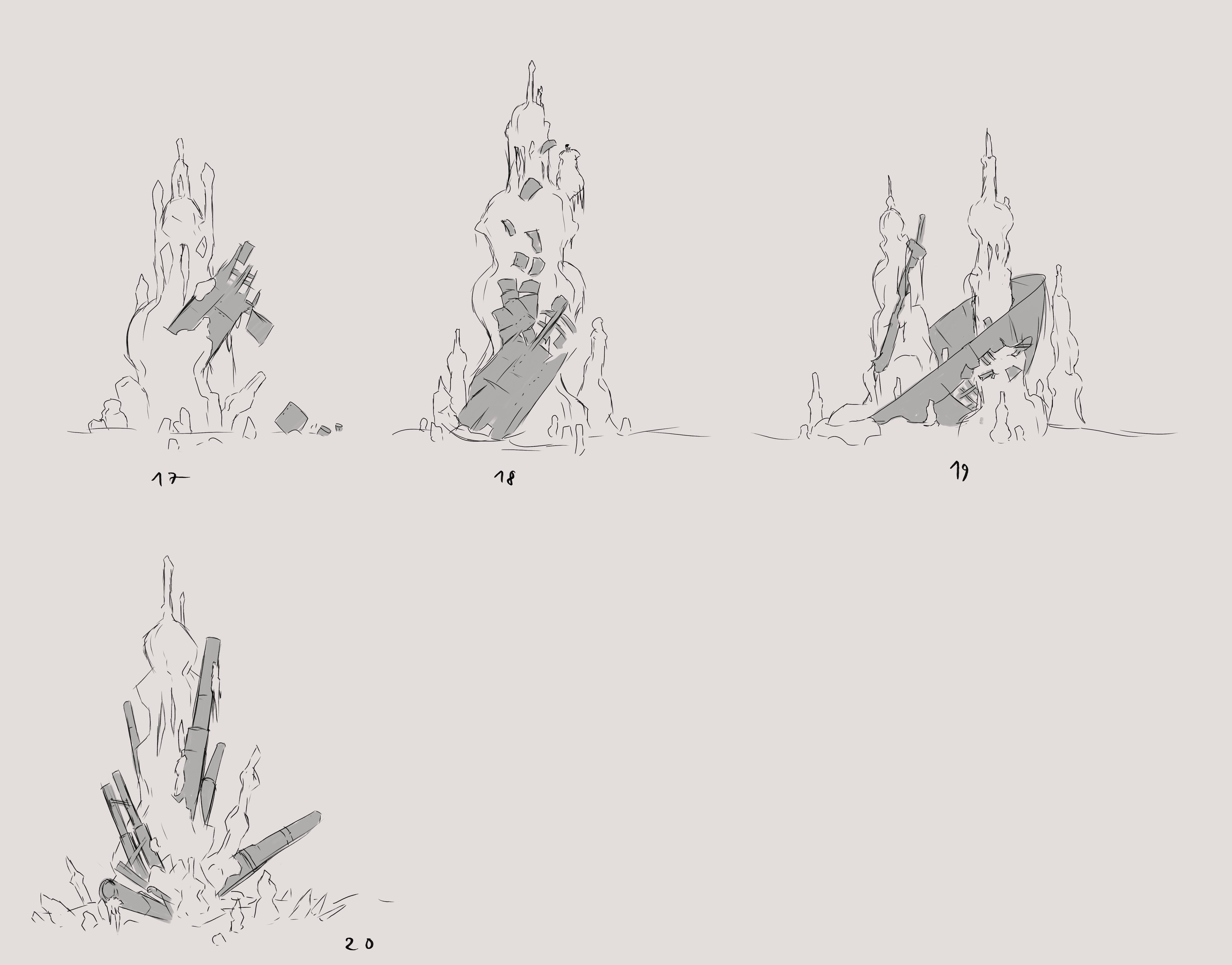
To further the strange unnatural atmosphere, the area is filled with these mineral structures.

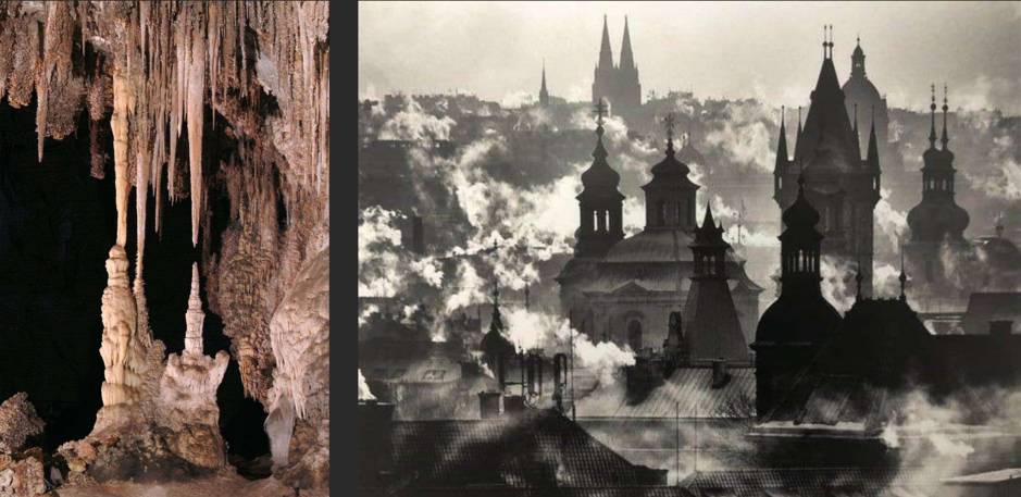
They are inspired by stalagmites and this picture of baroque rooftops. I thought those two things weren't that far appart in terms of shape and tried to combine them. I wanted to make it unclear whether those structures were natural or had been built. Additionally, we tried various materials with our 3D artist to reinforce this impression, and settled on these mineral-looking but slightly too slick and glossy textures for our structures of unknown origins.

The environment also contains metallic industrial ruins. I wanted to give the player one recogniseable thing in this strange world, something they could relate to, which also makes the rest seem stranger in comparison. Additionally, they help giving a past to the place, hinting that *something* happened for those remains to have been built and then destroyed.
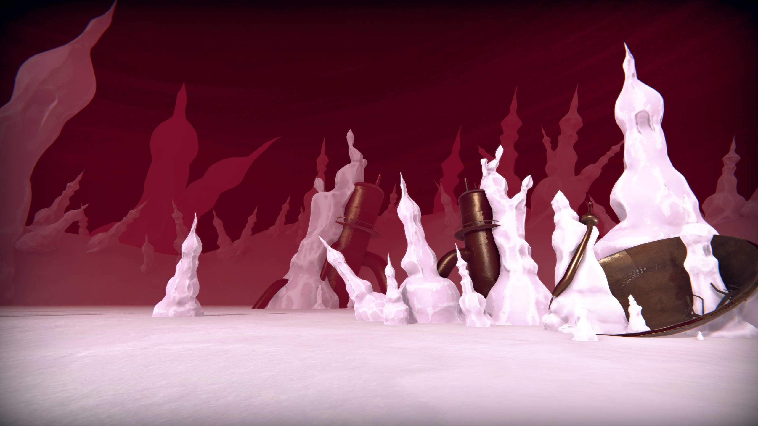
Player Character

As stated previously, the player controls a mech, and my starting point for its design was its armament. Something I find frustrating with mechs is giving them regular guns but larger. Instead, I tried to think of what would be more interesting and impacting, and would make use of the machine's scale. I thought about WW2 artillery and flak. It perfectly fit the feeling we were looking for and gave a direction for the rest of the design: old imposing machinery. I also decided to make it look all patched-up and worn out, with rust and wires dangling from it. I thought this aesthetic was coherent with the ruined environment. An inspiration for this is the anime Cowboy Bebop which features futuristic but worn and dusty machines and crafts with a lot of past.

Canon concept art Final model (All 3D art by Raphaël Martineau)

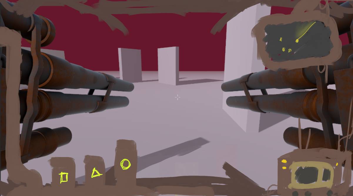
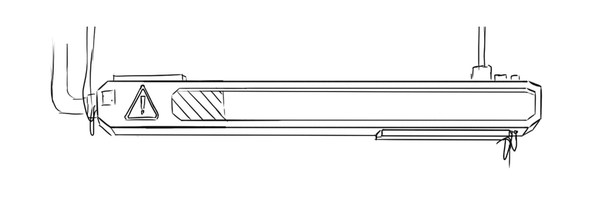
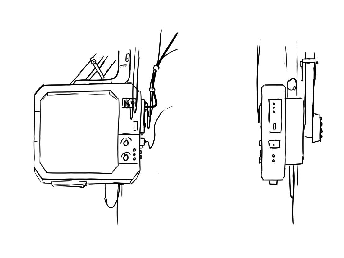
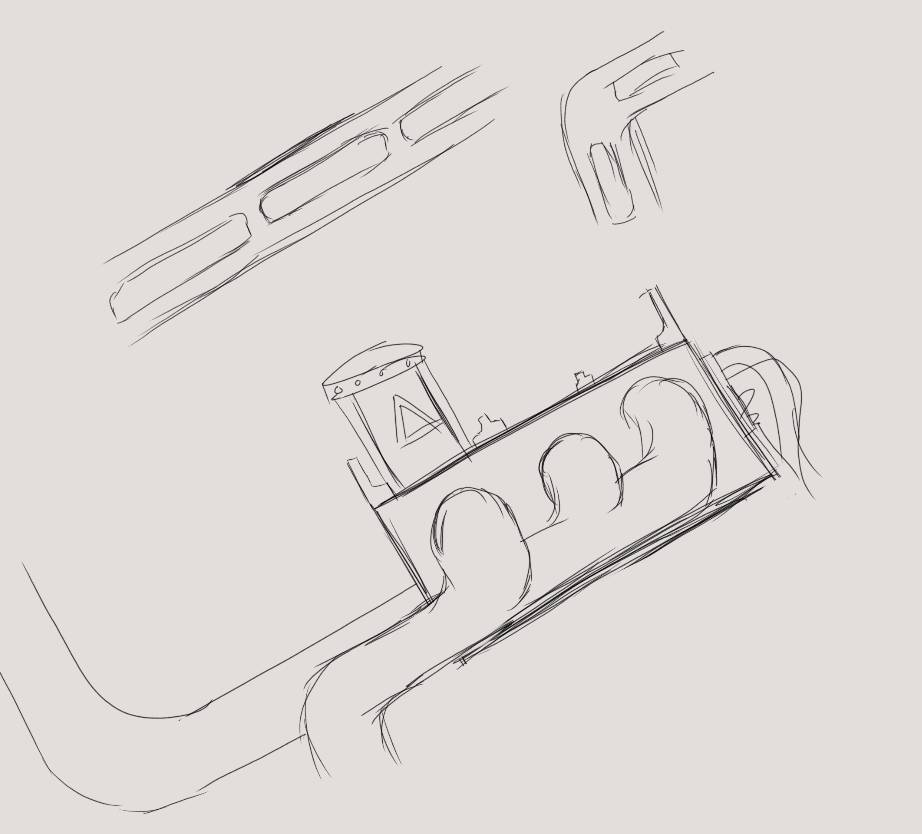
A core part of the design is the cockpit, we wanted the player to feel like they are in a big machine, so we did that quite literally. I wanted the player to be surrounded by tools and cockpit elements, to feel like they are safe and cut from the world outside. As a result, UI elements are physical objects in the cockpit rather than a HUD and those objects take a significant part of the player's field of view. We gave the player a radar to compensate for this lack of visibility while also reinforcing the cockpit feel.

Early mockup I made for the inside of the cockpit

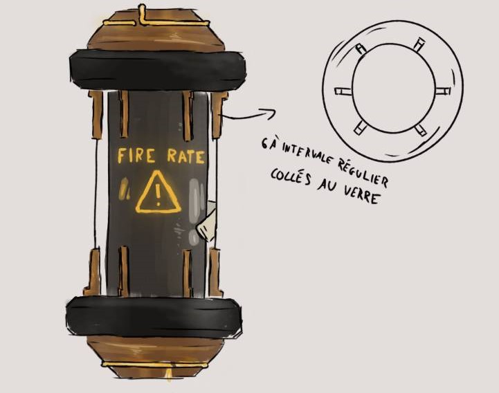
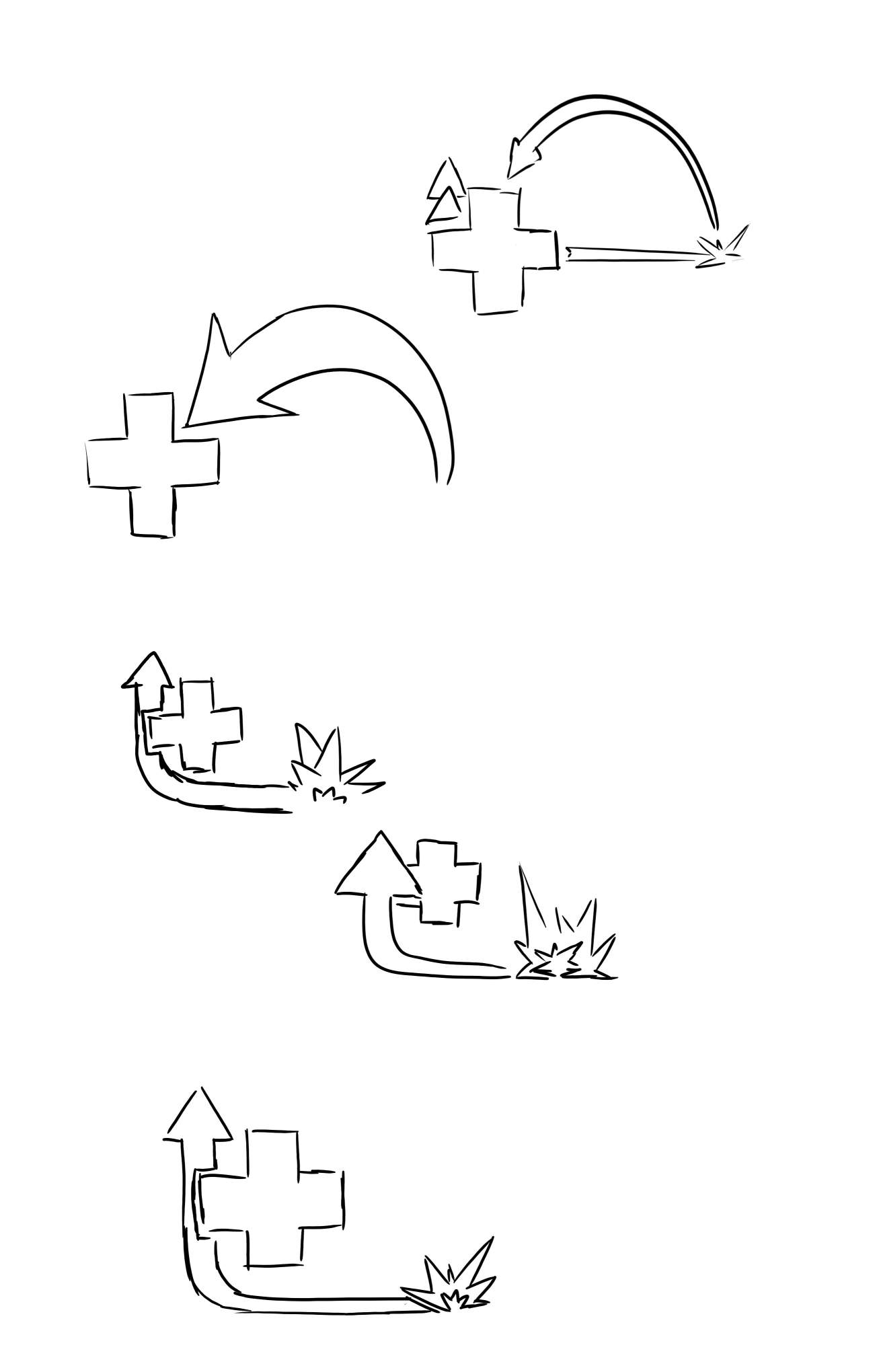
Finally, I designed the consumables the player can use, as well as the pictograms that differenciate their effects. The Capsules themselves are inspired by pneumatic tubes used to send telegrams around the 20th century.

The pictograms represent a fire rate boost, a movement speed boost, the possibility to recover health on kill and a charge respectively. Sketches and final designs below.

Enemies

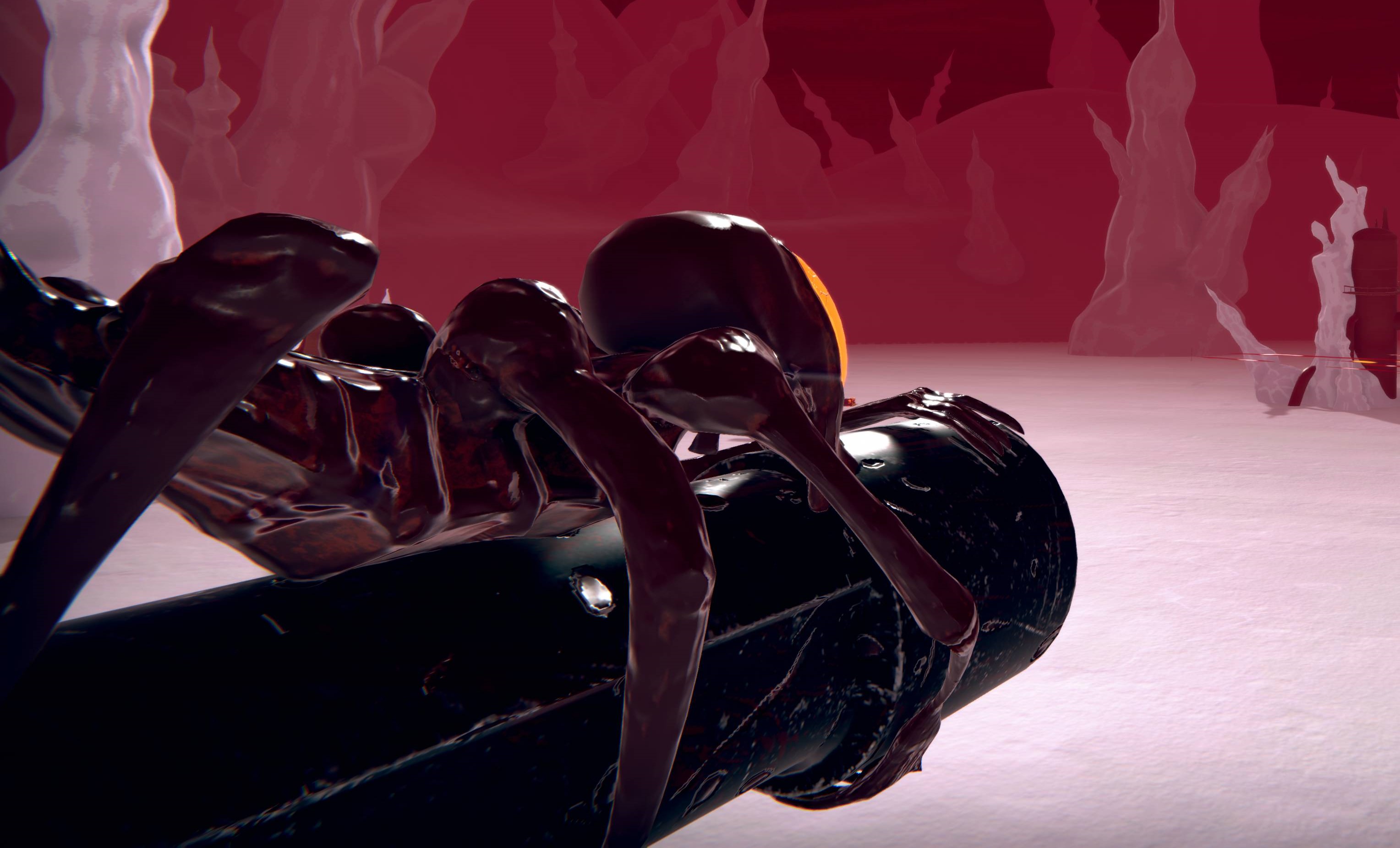
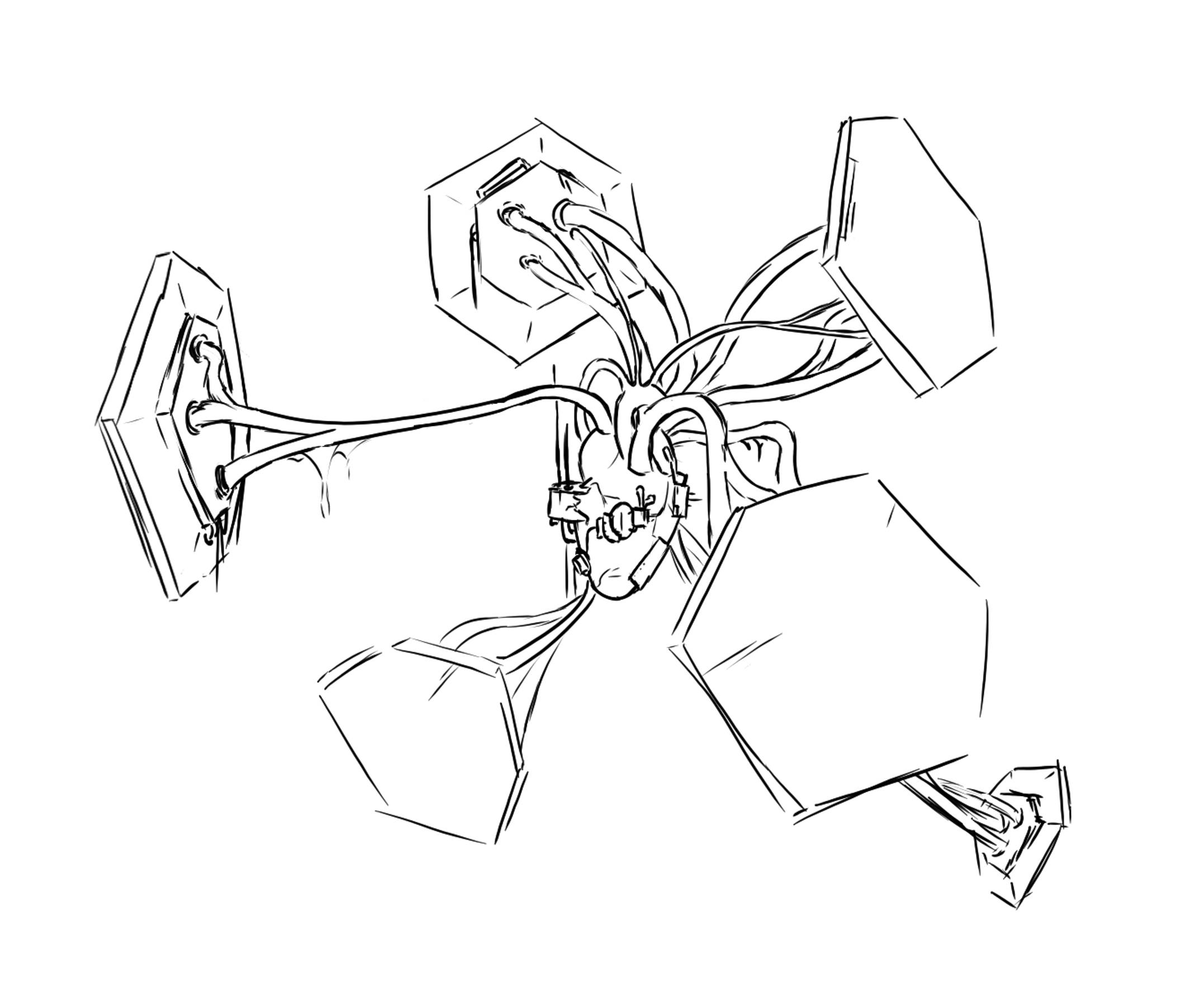
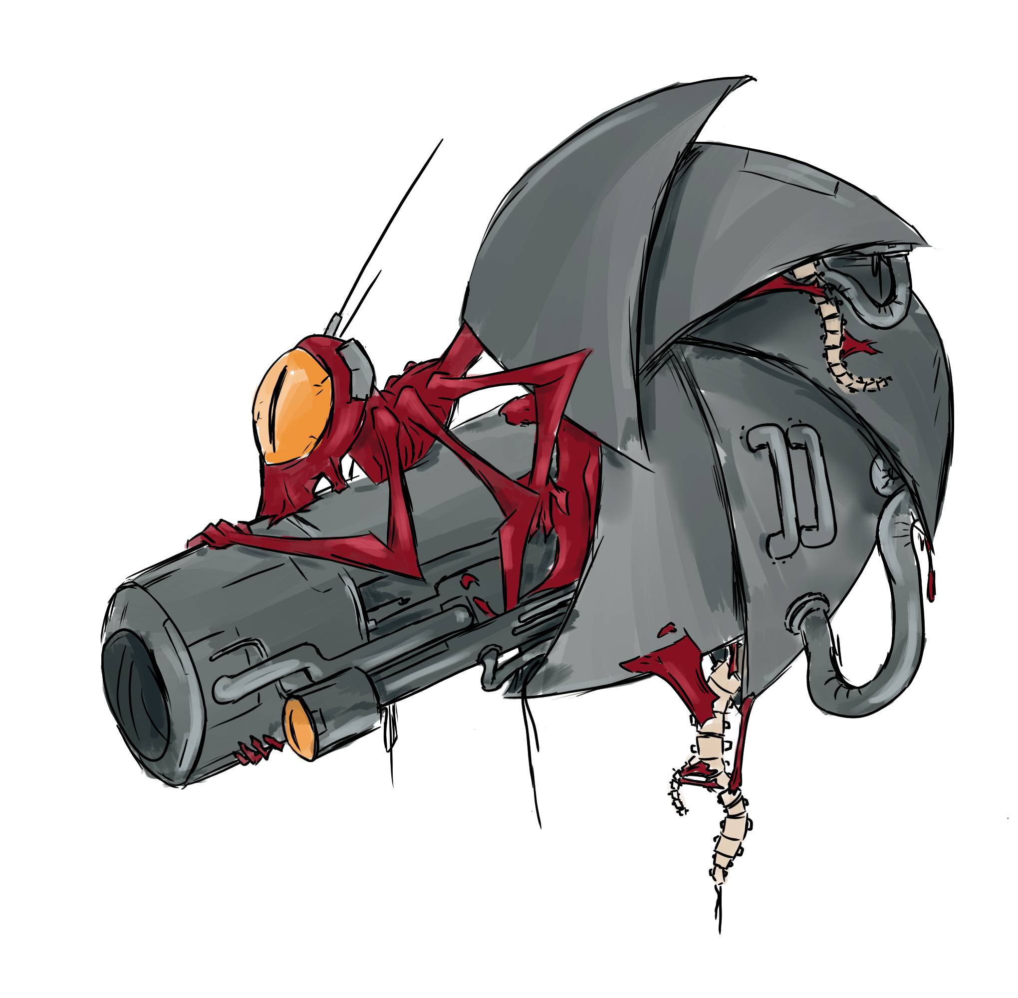
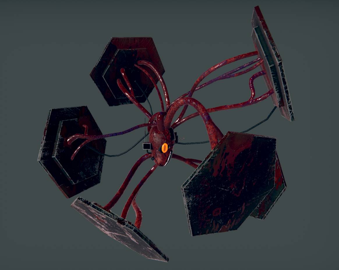
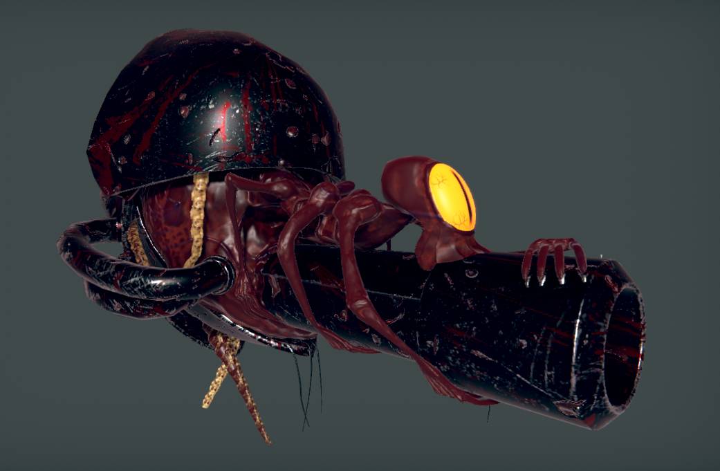
The bestiary of Unblighting is composed of monstrous creatures made out of flesh and metal. I wanted them to tie into the past we hint at for the environment, they are meant to make the junction between the alien landscape and the metallic ruins. I also wanted them to look grotesque enough for the player to want to shoot them without question.

Below you will find the concept arts I made for them alongside with the final renders used in the game.

The team

Raphaël Martineau

3D Artist, Sound Designer

Erick 'Edouine' Madec

Lead Developer, Game Designer

Matthieu Alle

Game Designer, Art Director, Concept Artist

Read another article:

Contact

alle.matthieu@gmail.com

Download my resume here